Hello archi lovers!
There are fascinating places, the architecture and design of a place can evoke different emotions and sensations in us. The visual captivates us and enchants us, and it does not only happen with mythical or historical places or monuments loaded with essence, beauty and something more. Sometimes in an ordinary unexpected place we can find different and striking spaces that make us look closely.
This happens with some restaurants or cafes, they have designs that they want to stand out from others, that have their own unmistakable personality, a brand or something that makes us remember the moment but also the place. And we like them when they are distinguished and unique, or when the atmosphere is simply charming.
If there is an elegant city where design is everything, it is Milan (or Milano in Italian), actually the Italian capital of design, and there are some trendy places in it, like Corso Como street full of nice and very cool places to hang out...
I could spend some moment there and despite not being able to entertain myself much with the details, due to the time, to pay attention to the entire company, also because there were a lot of people and because of the too much soft light that did not allow me to take the best photos in a hurry. And we can't always be aware of taking photos, right? But I can still show you a bit...
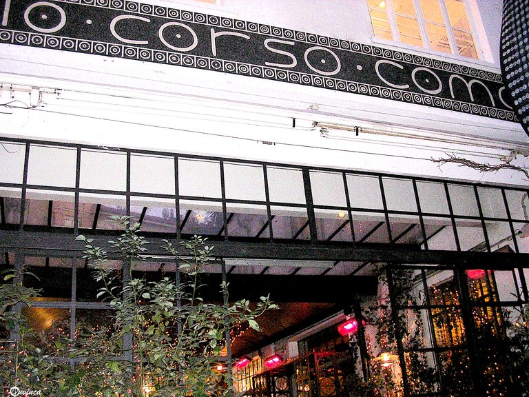
For example, one of those cool fancy places, very pleasant and curious, was 10 Corso Como Café, located on that popular street, and the typography of the sign at the entrance already caught our attention, different, simple and beautiful.
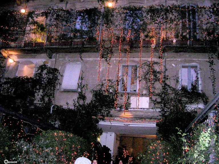
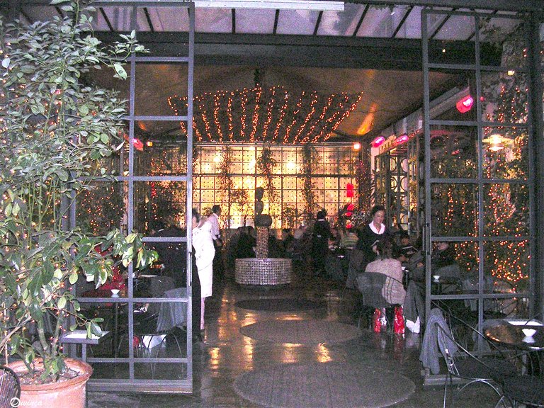
Then during the festive season, the lights make the atmosphere more welcoming especially when it is dark, but at the entrance they also lead us to a kind of interior patio, full of open plants and with a circular fountain in the middle decorated with bright pieces as a nice modern mosaic, although there were a lot of people and low lighting, that's the bad thing to see all well.
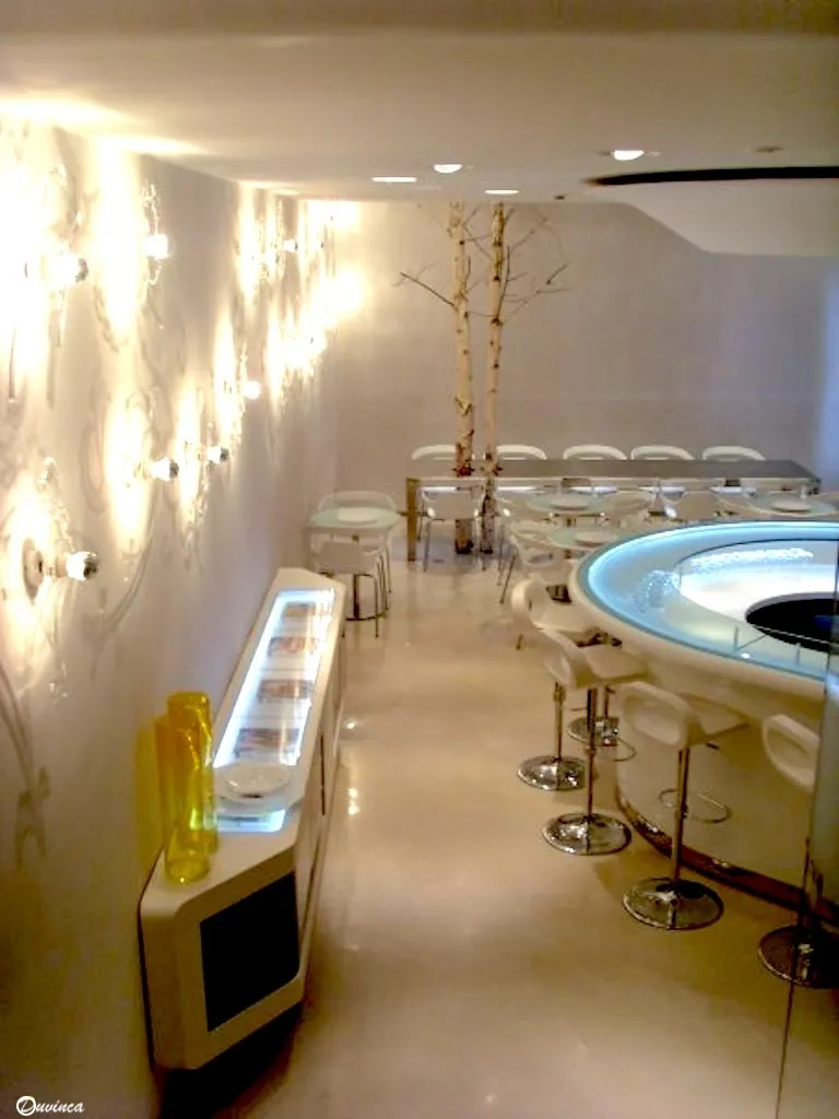
But the most curious thing is that speaking and I don't know how we went down to another area that seems to have not yet been open, modernism and minimalist design with simple and clean lines. As if we were in another place, but with the same elegance that this city boasts.
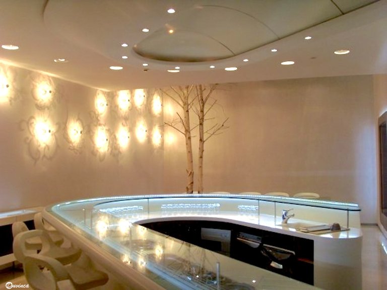

We return to the crowd and bustle, to that semi-interior area with windows, plants and lights, and a special wall. A wall is a wall, and it is usually decorated with some striking painting or mural, but here it was different, a wall with geometric relief but it also combined with the natural nature of all the plant decoration, giving everything an appearance that is different from what is typically urban chic, but more boho chic perhaps, what would you call it?
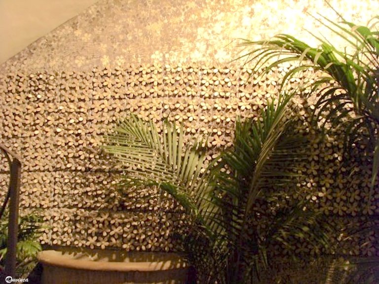
Sometimes a decoration as simple as that wall gives an unexpected touch to the entire space. And that eclectic mix of details makes the café a very pleasant place to be, to which we want to return so that perhaps with more light and fewer people we can better pay attention to all those details and that particular design.
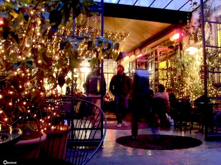
Because Milano is fancy, lavish, glamorous, unique, modern and classic at the same time, unrepeatable, with something special, a "je ne sais qua", something that fascinates, and in any cafe like the one we have visited as well as in its most famous monuments like "Il Duomo" we can see that its design and elegance are unrivaled. Ciao!
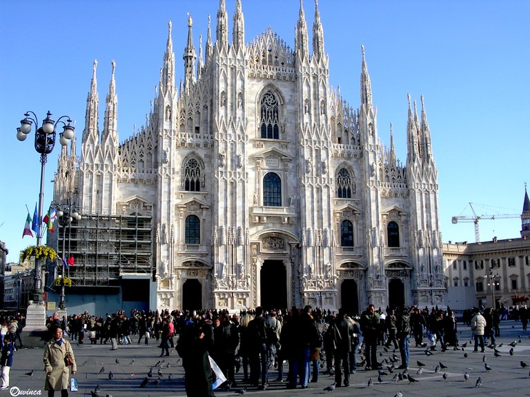
Milano, Italy🇮🇹❤️ Europe
Thanks for reading! Have a fancy and nice day.
The text is totally mine and the photos too, by ©Duvinca

