Hi everyone! 😄
I'm happy to be back to celebrate the Inktober, an annual moment that I cherish - Inktober is the perfect opportunity to push yourself, to go beyond your limits, like me, to get out of your comfort zone, because I'm not very good at imaginative illustrations like this - you have to juggle drawing problems but without falling into the too easy solutions of flat compositions.
Nevertheless, as you can see, I am very late in starting the series.
(But I have the whole month of October to do the drawings, don't I? :))
Actually, I would have liked inktober to have been two or three months earlier, because at that time I would have devoted all my time to drawing exercises, and I would have done inktober in a very studious way.
Unfortunately, the beginning of this month and the end of last month were very busy for me ; so I didn't had the time to do the first inktober on the right day.
But now that I am here, I will do my best to make as many (and good enough!) inktober drawings as I can :)
I think I will just choose the words that inspire me. So maybe I'll catch up by the end of the month ;)
Or maybe I'll be so busy that I'll only do 3 or 4. That's also possible, so I'm not promising anything in advance. I'm always good at putting pressure on myself for nothing 😆
Well, this introduction is long enough, so let's get on with the drawing :)
(thanks to everyone who read this far 😆)

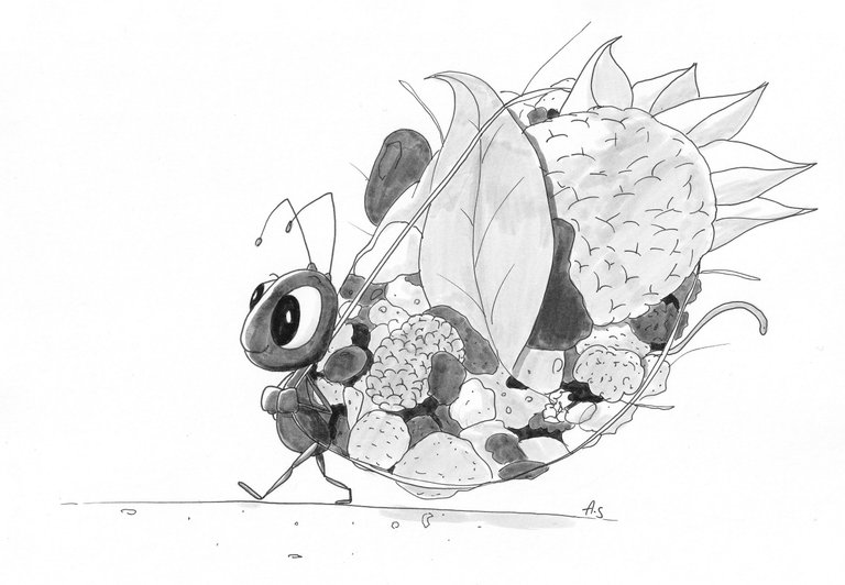
The word "Backpack" immediately conjures up images of a small figure with a big backpack.
Then, of course, I thought of the ant, which can carry 60 times its own weight!

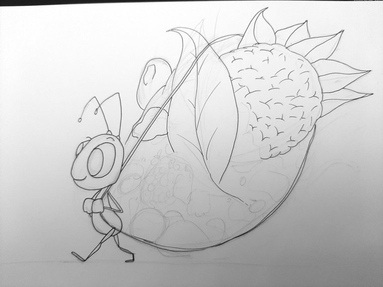
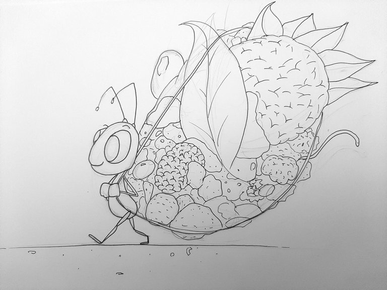
So I came up with a cute character design and made the nature-inspired elements in his backpack.

Then it was time to tone my drawing, so I used a brush in 3 different values.
But when I look at my drawing before colouring, I think I prefer the one before.
I have had the same problem over the years, I really struggle with colouring my inktober drawings. I find it hard to get the shading to be correct and consistent, so that it doesn't 'stain'.
The second problem is the texture of the brush pens. Rather than a smooth rendering as with digital methods, the result here is a 'slobbery' look that I feel loses all its volume as a very flat layer is applied over it.
Perhaps it's because I'm not using them properly.
But that's not so dramatic, because Inktober is the perfect time to try things out and learn from your mistakes. Maybe for the next drawing, instead of using these markers, I'll use a different method of shading, using only very fine pens (like stippling, for example).
Or maybe I'll watch a tutorial on how to use these brushes to good effect :)

So here is the final result, let me know what you think and if you prefer the tinted or un-tinted version :)

Hope you will like it!
See you (very) soon for more creations :)


