
The inLeo app in terms of a product has got all the boxes ticked from the get-go. The clarity on purpose, the modality as a social vehicle, DeFi utility, and future roadmap, everything is finely crafted for inLeo app.
This microblogging niche and as a tokenized community is informed by the most resilient and sustainable coin LEO in the Hive ecosystem.
That said UI/UX can not be discounted, because by default we are a social media platform, so flawless UX is a must and a fundamental underpinning of it.
With firm grit and commitment to UI/UX, and after spending sleepless nights, Khal and his team finally delivered a beautiful, buttery smooth stable app where threading is increasingly becoming an addiction of late.
The MAU is on the rise, and the number of threadcasts has been on the rise with different specializations and areas of interest. They have become new silos of engagement.
The #juneinleo prompt has come to an end and it has asked for feedback on the inLeo app.
As I said earlier, the inLeo has become stable and not crashing, the upvotes, comments, replies, etc are being broadcasted at lightning speed. That always gives credence to more fluid engagement. So once again thanks to the team.
Which new features have you tried?
(1) Blog post
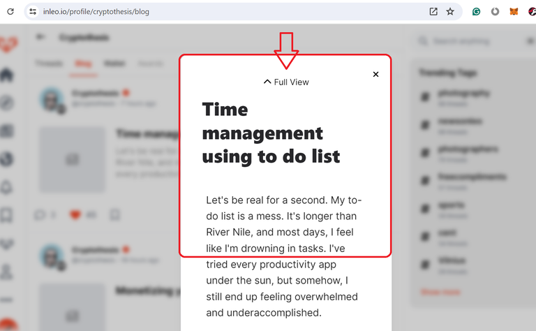
When I click on the blog post, it opens as a pop-up with a narrow view, one could go for a cursory look, and if he is interested in the first read, he can click on "full view", and then it will open the full page with wide view on the screen.

That's one good development.
(2) Raw Copy
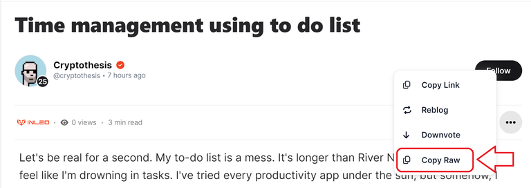
This is the best feature of inLeo and I like it the most. Whenever we want a raw copy of the post/article we dont have to use or search for any other tool, we can simply click on copy raw and paste it on a notepad and anywhere we want to.

I simply love this button. We can easily learn various markdown styling from others using this feature.
Suggestion
(1) Justify Align does not work
One thing I have noticed. Justify-margin evenly on both left and right does not work in inleo. I dont know why, despite using correct markdown styling. It works in other apps, but it does not work here.
I hope the dev team will look into it.
(2) The reading console can be made a bit wider like Hive.blog.
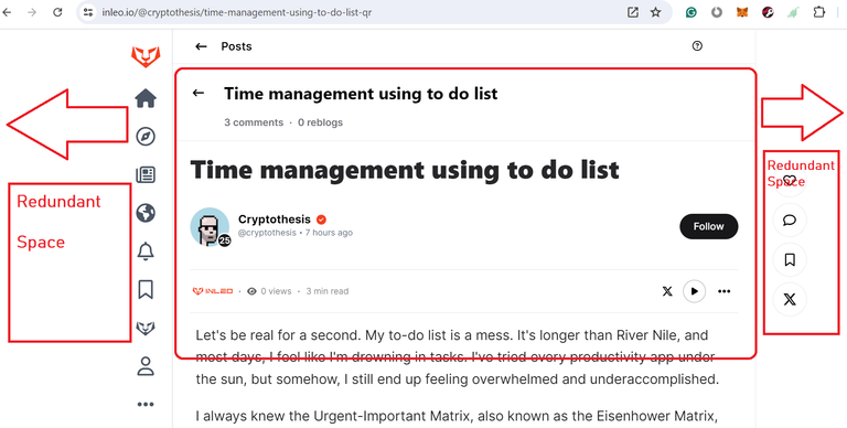
Upon clicking a blog post when it opens, it feels like we still have more redundant space left on both sides of the margin and the margin can be expanded a bit on either side to give a much wider reading console, and that will give a better reading experience like Hive.blog.

I am not a coder so I can not tell the technical intricacy of it, but if there is no such technical difficulty the dev team should consider shifting it to the right.
I must confess that because of the improved UI/UX and stability of the app, my engagement in the inLeo app has gone a lot better. I always have a strong appetite for the microblogging niche. And to be honest, in the Hive ecosystem microblogging is my primary motivation to stay afloat.
That's all. Thank you.

This is my participation for the Initiative: June Monthly Prompt
Check out the above post if you are keen to participate in a particular topic of the day.
Thank you.

Posted Using InLeo Alpha